Friday, Dec 2, 2016
Create print-ready dashboard using CSS
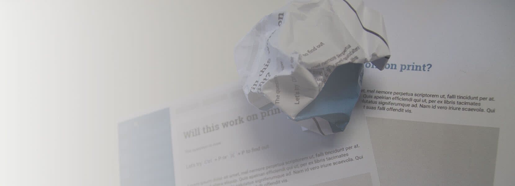
You've never used it, never heard of it, don't know how it works? It seems like the right time to introduce yourself to print CSS.
Have you ever tried to print out your website? If you did, probably by accident, you might ended up with a bunch of messy overlapping elements? No worries, print CSS is just what you need!
Even though printing websites, or parts of it, is not the most common thing these days, there’s still a chance you will have to do it, so it won’t hurt to catch up with some basics.
First things first - what is print CSS?
In today’s web design, everything is about adapting websites to different kinds of devices, and you should be familiar with media queries. In case you’re not, a simple definition of media query would be - applying different stylesheets depending on device window size. So, a print media query is changing the CSS properties of HTML elements in a way we want them to look on paper or in a print mode.
To get a better understanding of print CSS, we will use the dashboard as an example. Here is how our dashboard looks like on a desktop-sized screen:

…and here is our not so useful version when we try to print it out.

Print to the rescue!
What we want to do here is to adjust all the elements' positions, dimensions, and other CSS properties to fit the paper. We can achieve that by hiding elements that are not intended to be visible when printed, such as header and sidebar.
Here is a part of our CSS code for the desktop version of the header, sidebar, and main content.
.header {
	position: fixed;
	top: 0;
	right: 0;
	left: 240px;
	height: 60px;
	...
}
.sidebar {
	position: fixed;
	top: 0;
	bottom: 0;
	left: 60;
	width: 180px;
	...
}
.content {
	position: fixed;
	top: 60px;
	right: 0;
	left: 240px;
	...
}
The next thing we want to do is to hide header and sidebar - here’s the print media query:
@media print {
	.header, .sidebar {
		display: none;
	}
}
Depending on the HTML structure, there is a chance we will also have to adjust positions, margins, colors and other CSS properties to fit elements the right way.
@media print {
	.content {
		top: 0;
		left: 0;
	}
	.slider__controls, audio {
		display: none;
	}
	.title {
		color: #2f8aa7;
	}
	...
}
Our dashboard transformation from desktop to print-ready view is shown below.

Tips and tricks
Here are a few useful tips and tricks when using the print media query. As you can guess, elements such as video and audio can not be reproduced on paper. The best thing you can do here is to hide them, or show just the title. When using different kinds of slideshows, showing just one slide can do the trick. If you click here on paper you will not be redirected to a new paper, so showing a full URL is a way to go. Another useful feature is a possibility to switch between portrait and landscape orientation.
@media print{
	@page {
		size: portrait; /* or landscape */
	}
}
A page break is another good to know thing, especially when working with tables or other elements that can break to another page. By using these properties, you can set page break before or after your element, and prevent it from breaking in the middle.
@media print{
	table {
		page-break-before: always;
		/*
			page-break-after: always;
			page-break-inside: avoid;
		*/
	}
}
Just like CSS in general, the complexity of using print media query may vary. In some cases, hiding, showing or moving HTML elements will do the trick, but in others, you will have to change the complete CSS structure to get the results you are looking for.