Monday, Dec 23, 2019
Time for a change - extending our visual identity
We decided to breathe in a new life into our visual identity. It's been a long, but joyful process. Here's what we learned.
As Mono continues to grow and expand areas of focus, we wanted an identity that reflects a change in a way we communicate internally and how we present ourselves to our clients and community.
Mono has been in business since 2003., focused on delivering world-class software products. Our visual identity had one major redesign since the beginning, introducing a recognizable logotype and a color scheme that reflects our energy and passion.

Initial design meetings
Last year we decided it’s time for evolutionary change. We worked hard with Marivo and Symbol to breathe a new life into Mono visual identity.
Creating and defining organization structure
To find out more about company’s culture, it’s best to ask employees - so we did. Symbol’s team conducted an internal research on our organizational culture, which gave out some interesting results.
For example—we like Star Trek more than South Park, prefer open source over proprietary software, emphasize learning and knowledge as key values.
In the future, our employees see Mono as the region’s leading IT company with twice as many employees as we have now. About 80% consider we’re working on exciting projects and doing remarkable new things with the latest technologies. On the flip side, most employees think that tight deadlines are responsible for most of the conflicts.
All of this and more was valuable information for building a new “internal” and “external” design.
Design Direction
Once the team got all the research data, we started hoarding all of our (good and bad) ideas and sending it to Marivo, so that they could transform them into design iterations.
The first step was to present Mono in a new, joyful way. Top-notch people and technology are what defines us the most, so we wanted to merge these into one coherent design approach.
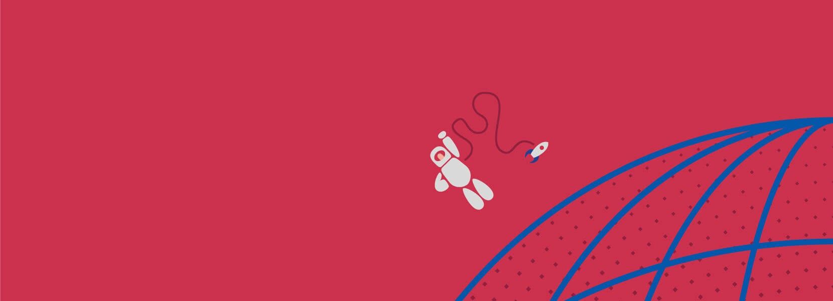
The original design - minimalistic, monumental, but a bit “cold” - was softened with a new vivid, high contrast and VGA-look color scheme, based on early computer games.
We had a few typographic choices, from Swiss-type to modern sans-serif typography. Eventually, we settled for sans-serif National 2, a revised version of well known National by Klim Foundry.
National 2 was redesigned and tweaked to work as a print and web typeface; it brought a perfect balance to our design.

Logotype
The logotype was tweaked by replacing old typeface with National 2 and adjusting relations between elements.
![]()
Old vs. new logo
Web meets print
We are a software company and our core business is web-based, but our design team also works on internal and external print materials. It was vital that we could reuse provided design components in all media — print and web; that’s why we chose a component-based system.
Thinking in components
Our primary mission was to produce a modular, component-based design that can be extended after Marivo completes the design process.
Pre-defined relations between colors, small and large elements, as well as typefaces, provide essential guidelines for future design implementations. We wanted to create a (mini) design system which works for all sort of visuals — social networks, featured images, posters, in-house design and much more.
Production and finalization
Once the ideas were transfused from the online playground to the physical world, the final design we received was exceptional.
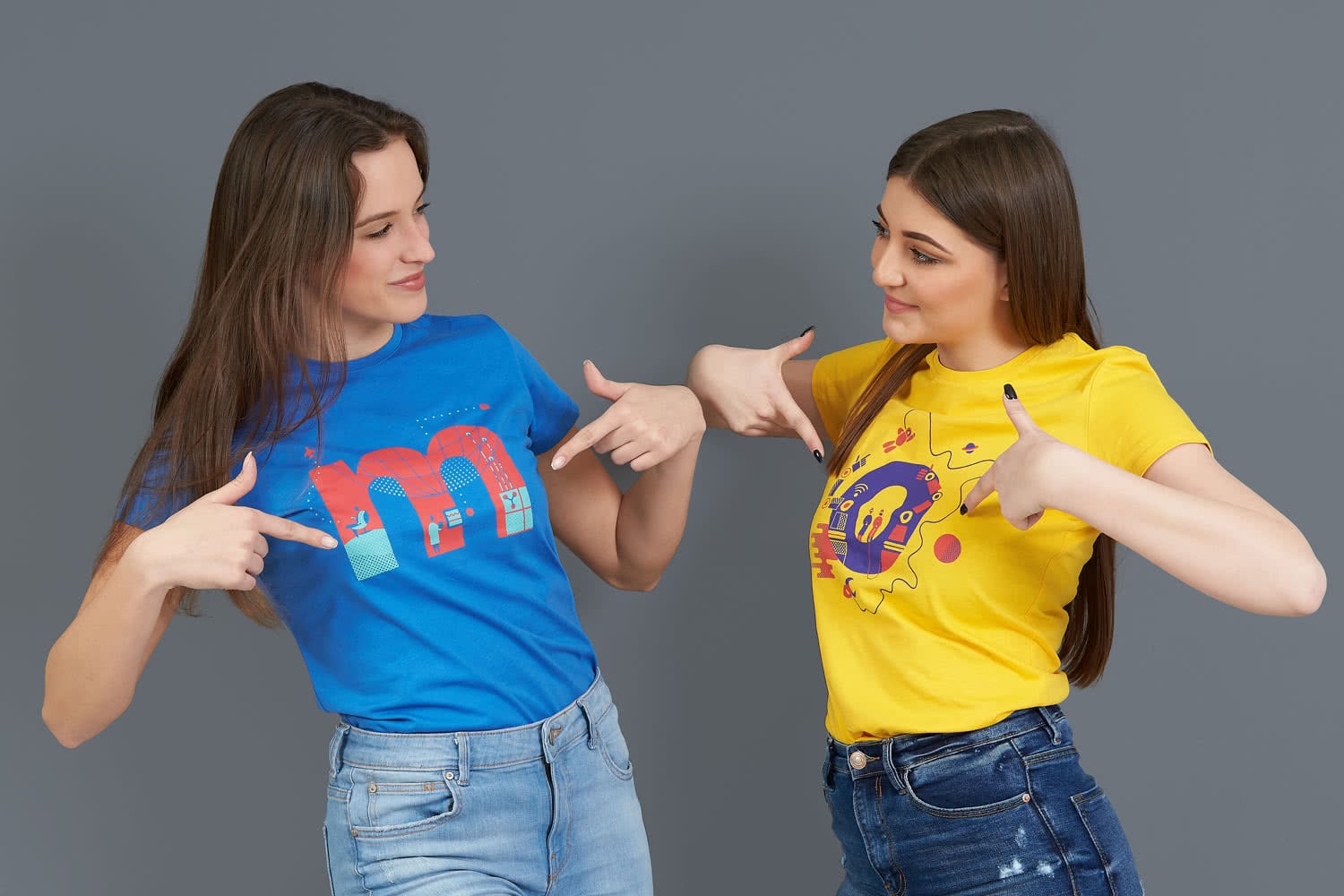
T-shirts (click image to see full preview)
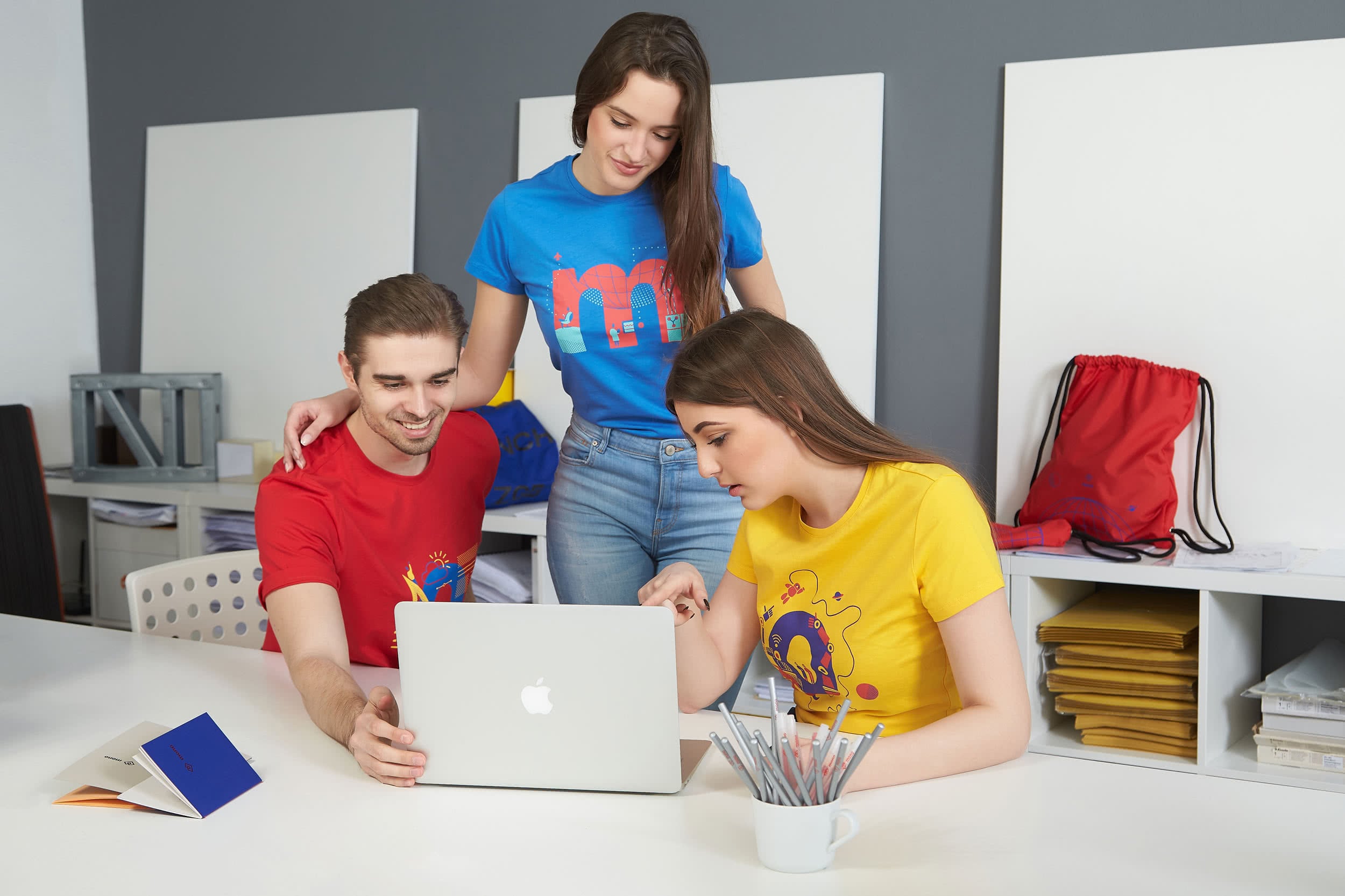
T-shirts (click image to see full preview)
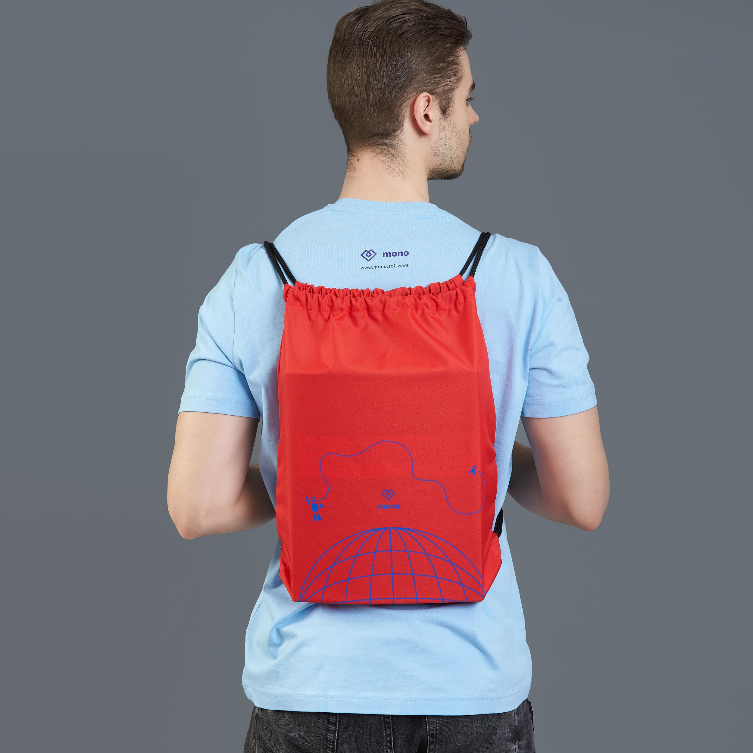
Drawstring bag (click image to see full preview)
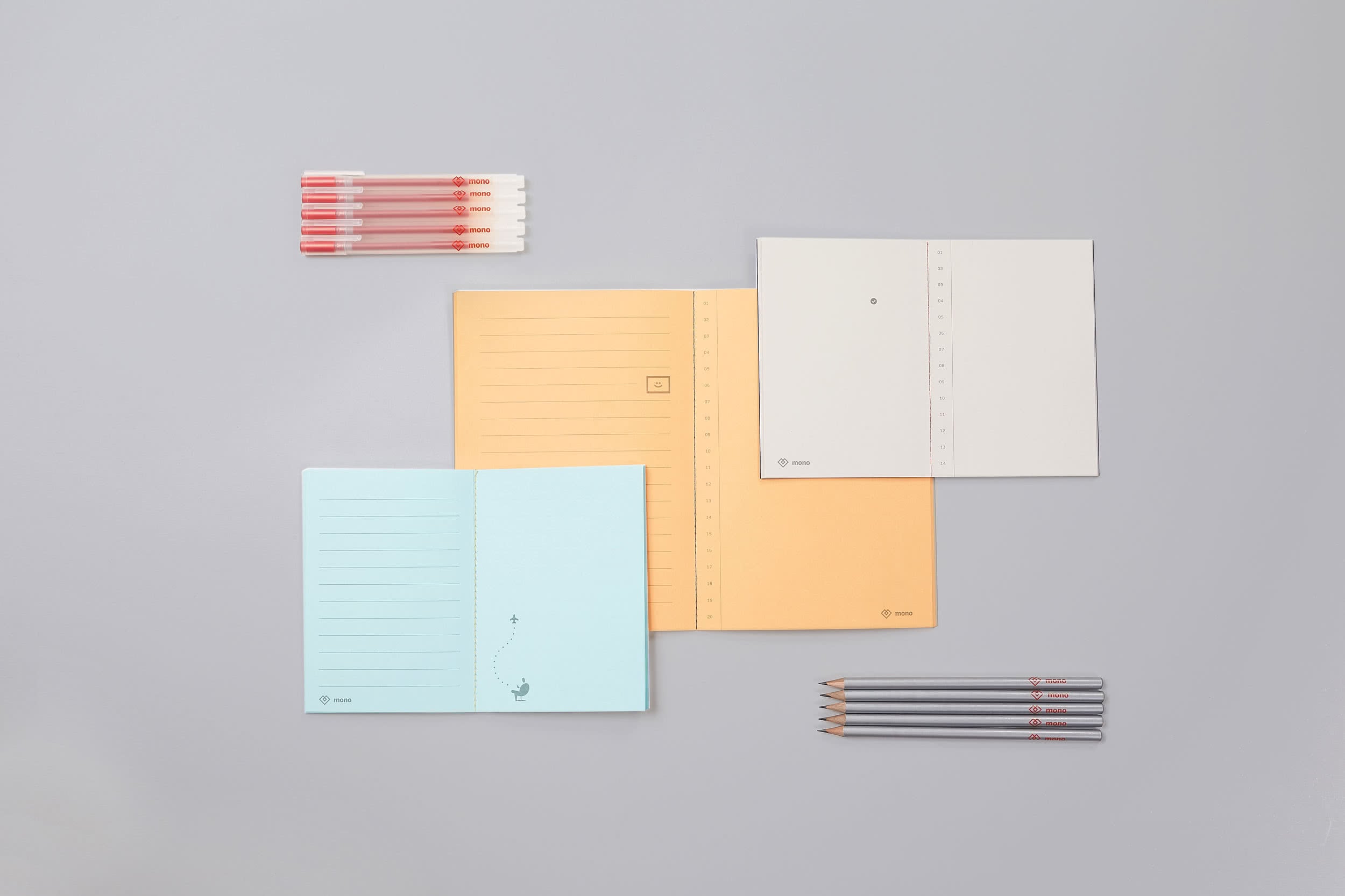
Stationery (click image to see full preview)
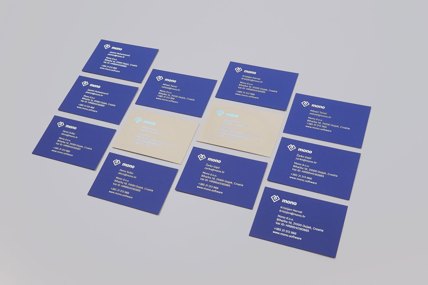
Business cards (click image to see full preview)
View and read more on Behance showcase.
Team
Thanks to everyone for their hard work and breathing a new life in Mono’s brand!
- Marivo (Marko Jovanovac)
- Symbol (Ante Vekić)
- Mono (Mihael Tomić, Denis Sušac, Žarko Gajić, internal design team)
- Bunch (Goran Roksandić)
- Photos (Kristijan Cimer)
- Animation (Dražen Željković)
—
Bunch studio supervised printing and verified the quality of finished products. Thanks guys and girls!